Article –
7 Mar 2025
Why most UX work is wasted in eCommerce

Every eCommerce company wants to say they “do UX”.
They hire a UX designer. They run some user interviews. Maybe even throw around words like “empathy”, “personas”, and “human-centred design.”
And yet – six months on – conversions are flat, nothing has shipped, and the only thing anyone’s really optimised is the sitemap.
Now, I am not anti-UX. Believe me. I’ve worked in UX research and care deeply about user behaviour.
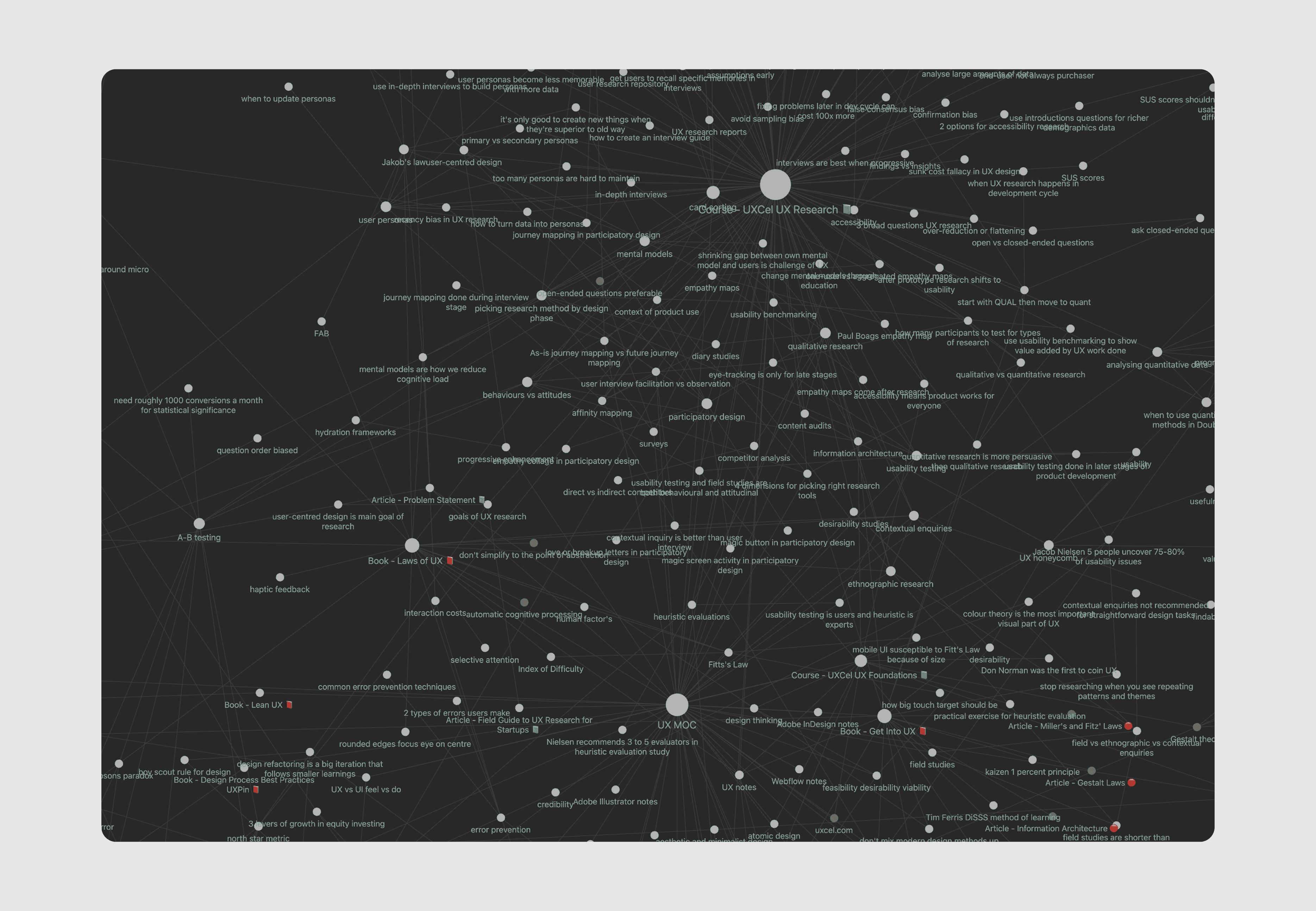
In fact, here’s a snapshot of a portion of my UX notes in Obsidian (to show you I really do know what I’m talking about):
But in most eCommerce brands, the way UX is approached just… doesn’t work. It’s too slow, too rigid, and too detached from the actual goal: getting people to buy.
Let’s talk about why.
The Double Diamond trap
The most common UX process is the Double Diamond:
Discover → Define → Develop → Deliver.
In theory, it’s about deeply understanding users, then solving their problems with design.
But in practice, It often leads to:
Long research cycles with vague outcomes
Endless reframing of “the problem”
Wireframes for journeys users already understand
Prototypes polished to death before a single real user sees them
It’s not uncommon to spend weeks on a “discovery sprint” just to confirm that yes, users want fast delivery and clear sizing info. Who knew?
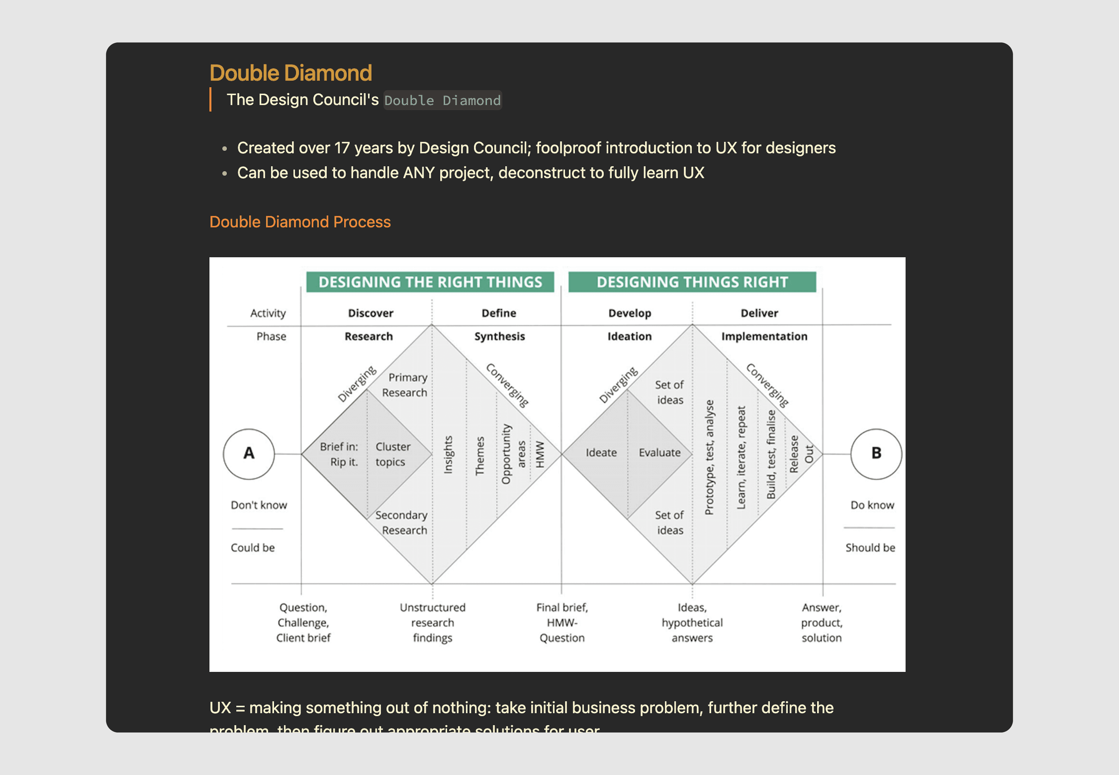
When speed, sales, and agility matter – as they do in eCommerce – this process is just too heavy.
eComm customers don’t need a new journey
Here’s the truth: most online shoppers already know how to buy things. The mental model is fixed.
Homepage → Category Page → PDP → Cart → Checkout.
They’ve done it a hundred times before. They're not confused about how to shop – they’re hesitant about whether to buy.
The real questions in their heads aren’t:
“How does this site work?”
They’re:
“Can I trust this brand?”
“Is this product really worth £89?”
“Will this actually solve my problem?”
“What’s the return policy if I’m wrong?”
Traditional UX focuses on navigation, flow, structure – things most eComm users don’t actually struggle with. What they need isn’t a redesigned funnel. They need reassurance. Clarity. Motivation.
This is where conversion psychology beats process-led UX every time.
Conversion Psychology > UX Research (mostly)
Conversion psychology focuses on the emotional and cognitive triggers that drive action:
Framing and value perception
Social proof and urgency
Trust and friction
Decision paralysis and effort heuristics
It’s not about personas. It’s about behaviour. And it’s testable.
You can measure if “Free returns, no questions asked” outperforms “30-day returns policy.” You can see whether specific headlines convert better than vague ones. You can watch scroll maps and session recordings to pinpoint where doubt creeps in.
That’s not anti-user. It’s pro-reality.
UX research is valuable—but in eComm, it often over-indexes on understanding users in general instead of customers in context.
What I’d do instead
If I were running the show, here’s the approach I’d take:
Start with quick wins – a heuristic UX audit can surface obvious issues fast (e.g. missing form labels, unreadable text, unclear CTAs).
Mine existing data – use GA, Hotjar, post-purchase surveys, and returns data to spot friction points and doubts.
Run lean user research – 3–5 unmoderated tests or checkout recordings can reveal huge insights in a day.
Test psychological drivers – headlines, trust badges, product guarantees, benefit-focused copy.
Prioritise speed to learning – better to test three rough ideas this week than one perfect one next month.
This way, you’re still user-informed—but biasing toward action, not documentation.
UX isn’t useless, it’s just often misapplied
I’m not saying fire your UX team or scrap research entirely. But we need to be honest: UX, as it’s often taught, was built for complex product ecosystems, not product pages.
In eCommerce, the gains come from aligning what you say and show with how people feel when they’re about to part with money. That’s not something you’ll find in a persona. That’s human behaviour under pressure – and that’s where conversion wins are hiding.
If UX is slowing you down or stuck in theory, maybe it’s time to switch gears.
Conversion first. UX second.