Case study
Rebuilding a US skincare brand’s site to increase conversions by 55%

Intro 👋
One of the reasons I call myself a “conversion developer” is because I like wearing different hats…
It’s not unusual for me to start a project as a web developer, and end up helping with copy. Or start a project as a CRO consultant, and end up building React components…
Sometimes it’s just quicker and easier to merge strategy and building (that elusive sweet spot in CRO that many claim they can do, but few can).
And no project is better evidence of that than this one: me spearheading the complete end-to-end rebuild of a major eCommerce storefront.
Problem:
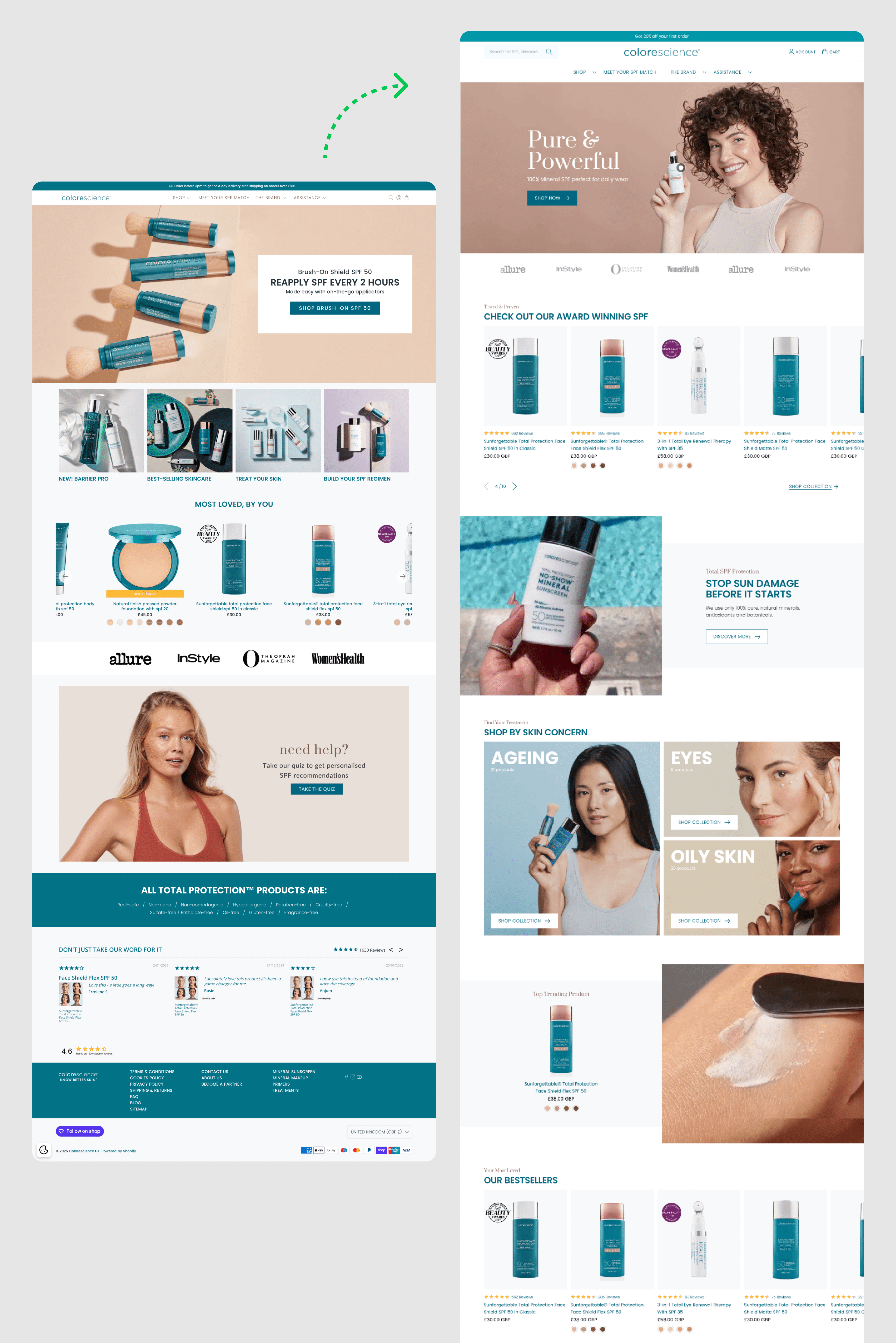
ColoreScience is a major US skincare brand selling mineral SPF products. When my company first inherited the UK side of it, the brand had strong product-market fit (the UK site was already converting, albeit modestly).
But under the hood, the storefront was in rough shape. The team was running a legacy Shopify theme called Flex, which seemingly slowed down with each upgrade – to the point where mobile product pages took up to 10 seconds to load! (Yes, really!)
Solution:
Initially, I approached this project like any CRO initiative: run tests, gather data, find wins. But I quickly realised that the site’s foundations were too weak for meaningful experimentation.
Speed issues alone were killing conversions, and the UX hadn’t kept up with modern customer expectations – especially on mobile. If we were going to see any real lift, we had to tear it down and start again.
Believe me, this wasn’t a light decision. In CRO, there's a strong principle of iteration over reinvention – you optimise what's there first. But sometimes, what’s there is standing in the way. Rebuilding became a CRO decision in itself.
Discovery/Research 🎯
As part of the rebuild, I ran a full analytics audit to better understand who we were designing for and where the biggest opportunities lay.
In GA4, the product pages stood out as a problem. On mobile, 71.5% of users dropped off on the PDP, often without scrolling or interacting at all.

It was clear these pages had become too bloated and slow, especially on touch devices (the majority of traffic). Interestingly, mobile and touch users showed higher engagement overall, so the decision was obvious: prioritise these users first.
We also found that many pages across the site received almost no traffic. People weren’t browsing the way we expected, they were hunting for products. This led to a rework of the top-level navigation to make it more transactional and product-focused, rather than category-led.
To dig deeper into usability, I installed Microsoft Clarity (which, honestly, is shockingly good for a free tool). The session recordings showed exactly what was going wrong: PDPs took far too long to load, and once they did, users were hit with so much content up front that important elements like reviews and product benefits were completely missed.
Finally, I suggested our UX guy interview customers directly to give us a clearer picture of the audience: 75% female, mostly aspiring middle-class professionals with growing disposable incomes.
This insight shifted our focus. We knew we weren’t competing with bargain skincare brands, but with premium, lifestyle-led sites. So I started compiling a list of direct competitors to see how they handled things.
Strategy: Speed over Perfection 🧠
One of my core eCommerce CRO principles is speed over perfection:
A lot of people get bogged down in frameworks, treating every small design decision as if it needs to be “Double-Diamond’ed” up the wazoo.
Now, that can make sense if your website is your product (like in SaaS). But in eCommerce, customers already come with a mental model. They’ve shopped before. They’ve seen good and bad sites.
So instead of reinventing the wheel, I focus on moving fast and building from patterns that already work.

To do this, I created a CRO audit doc that not only analysed our own site, but dissected features from competitor sites that appealed to our target audience.
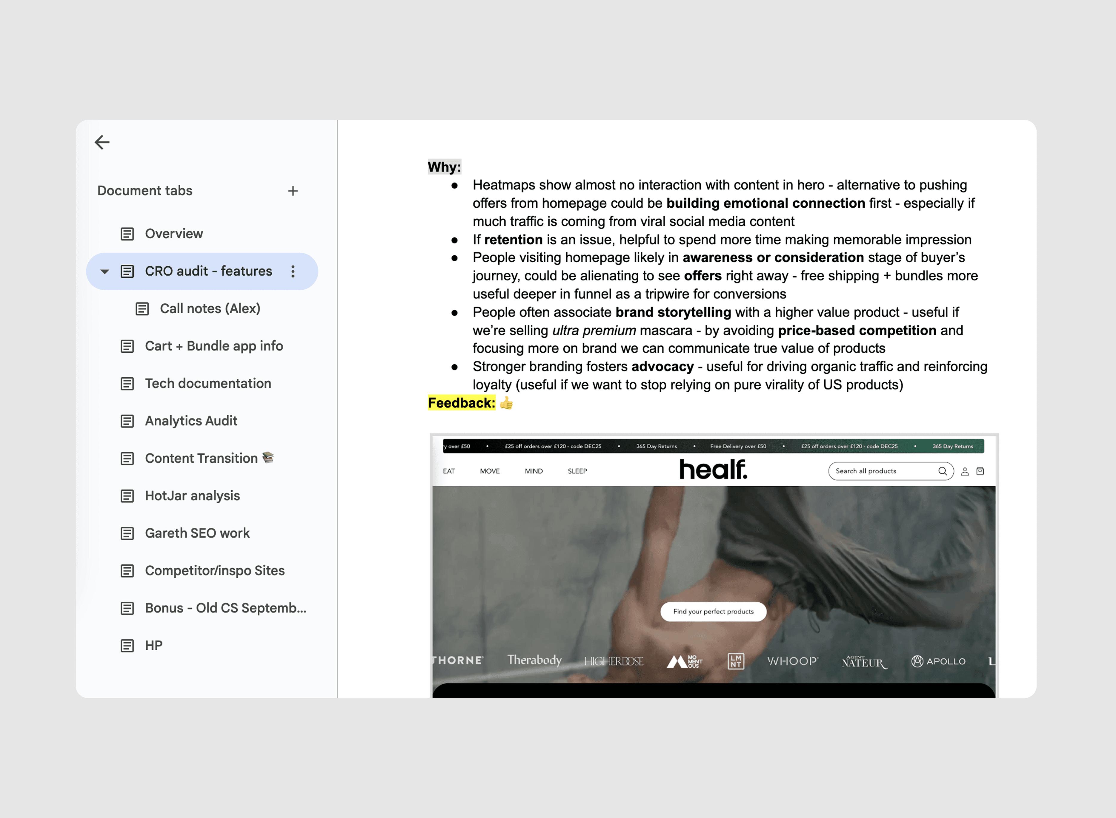
I broke them down in the same structured way: what problem they solve, how they’re implemented, and where they might fit in our flow.
This gave us a clear, editable pool of proven ideas to pull from, rather than starting every discussion from scratch. It also helped me push back on the idea that we needed to A/B test everything. We didn’t need more data to tell us a 3 second load time on product pages was bad.
Leading UX and Bridging the Gaps
So, what started as a quick CRO project quickly morphed into a full-on UX overhaul. I led our UX designer through a process that mixed conversion psychology with the American guidelines.
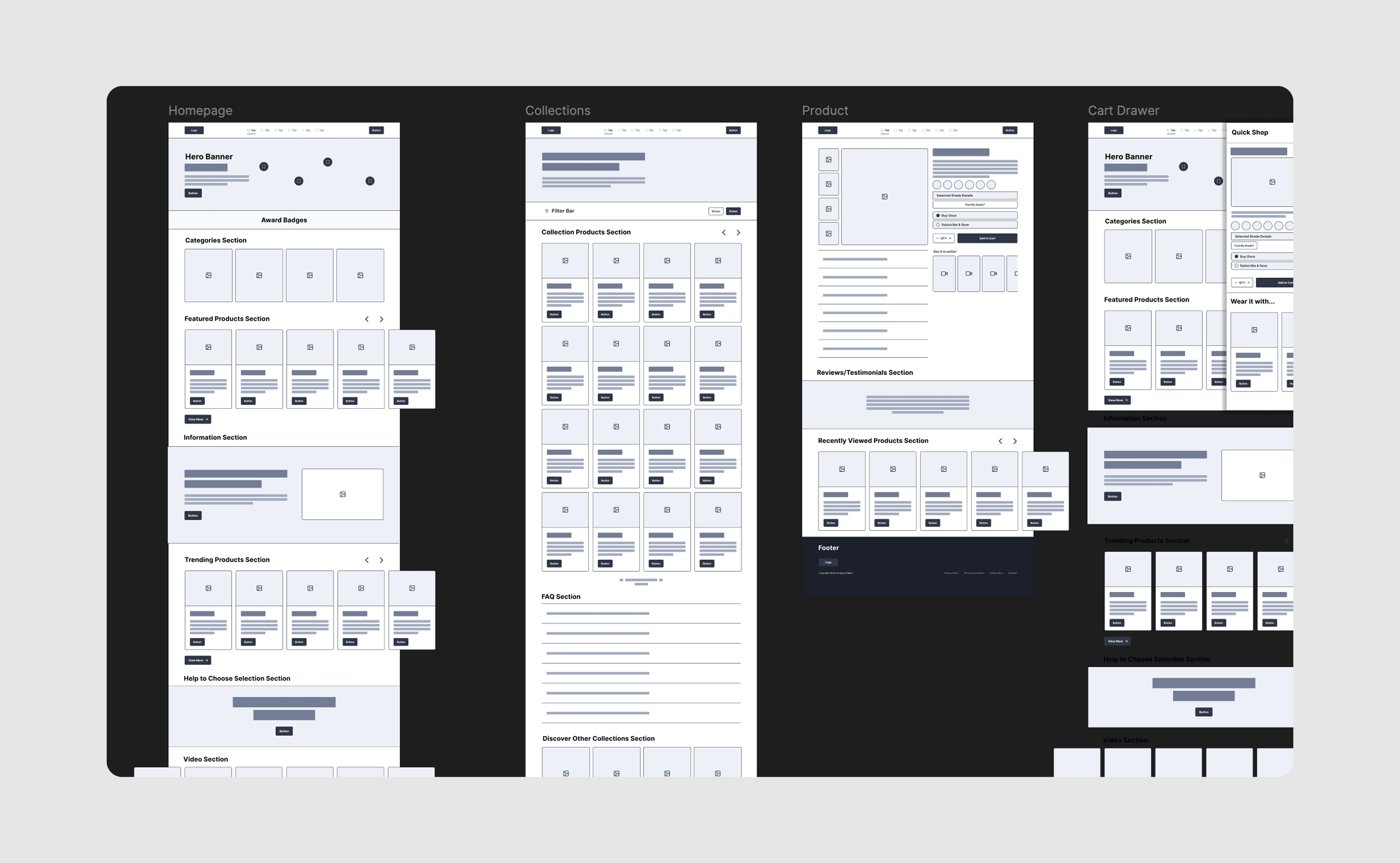
We knew 80% of our users were on touch devices, and this insight led to a bunch of UX decisions. We killed traditional click-based carousels and rebuilt them with swipe interaction in mind.
We redesigned navigation to work better with thumbs (fewer options, bigger touch targets). We benchmarked top competitor sites for inspiration, then mapped those features against our own audience needs to build a conversion-focused roadmap.

With no dedicated technical PM or dev team, I took full control of implementation. I was the only one who could translate creative ideas into code, talk to marketing, and keep one eye on CRO fundamentals.
That hybrid role of being part strategist, part builder is where I feel most at home.
The Boring Technical Stuff
At this point, I was at a crossroads. As the solo developer on the project, I knew I had to find ways to stay efficient. This led me to using the Dawn theme as a starting point.
It wasn’t just about throwing stuff together. I had to consider scalability. It was super important a developer other than me could understand and work with the code easily.
Frankly, for whatever people say about how “easy” Dawn is to work with, it has a hell-of-a-lot of quirks: especially with its utility class structure.
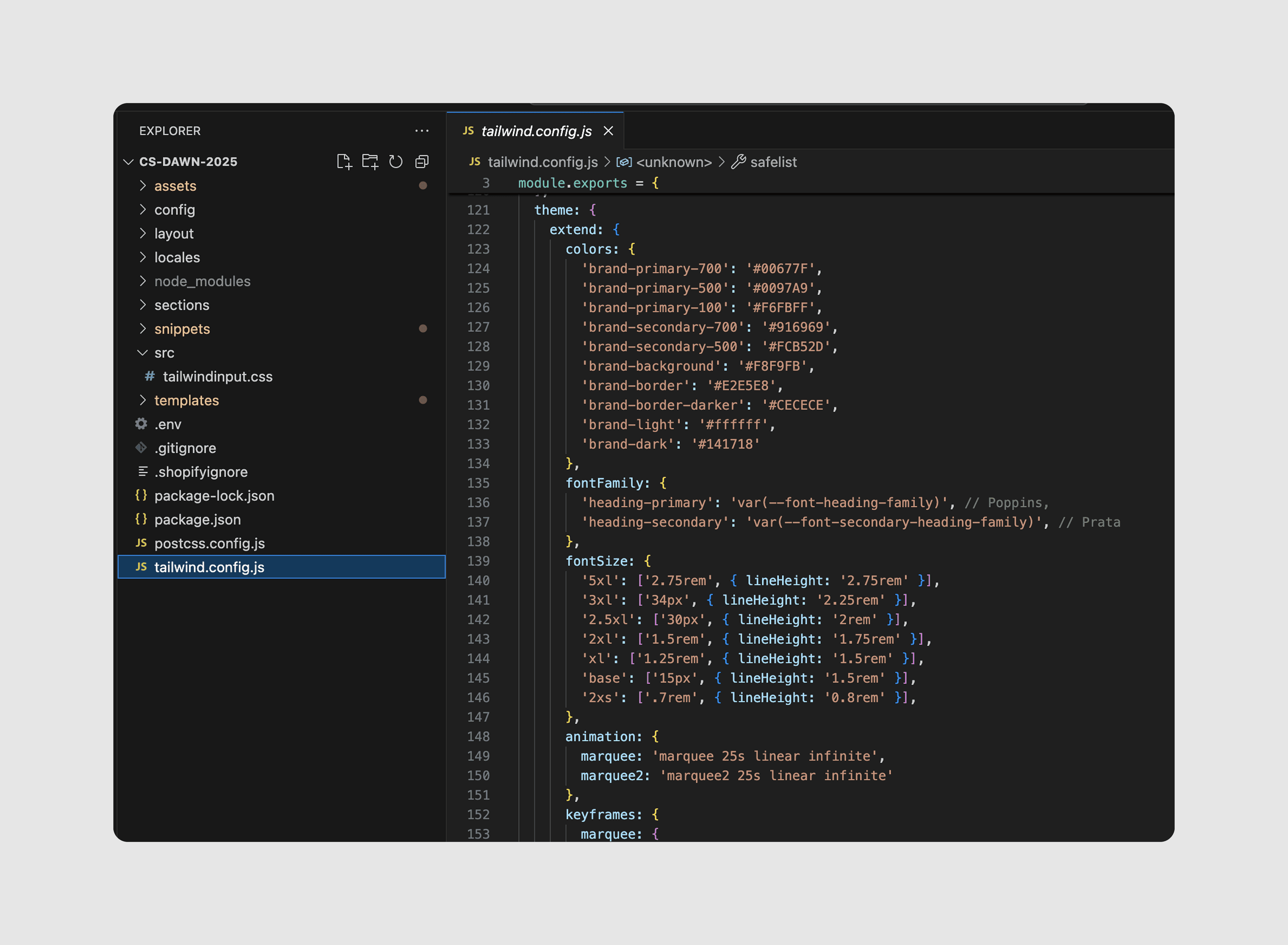
Because of this, I completely broke the rules and took a hybrid approach: I installed TailwindCSS into the project and rebuilt major components (product cards, PDPs, layout blocks) using these classes.

This let me move much, much faster and gave us way more control over the design. To prevent conflicts with Dawn’s styles, I prefixed all Tailwind classes with an underscore (e.g. _bg-red-400), which kept things clean and easy to scan.
To support this workflow, I set up a local development environment with proper tooling – PostCSS, Shopify CLI, and an env file with IDs to push/pull themes faster.
/node_modules – local-only folder containing all third-party tools (not uploaded to GitHub or Shopify)
/src – contains the core Tailwind CSS file
package.json – blueprint of the environment. Run npm install and it installs everything you need into /node_modules
.env – contains non-sensitive variables like theme ID and store URL
.gitignore / .shopifyignore – used to prevent uploading unnecessary or system-specific files
postcss.config.js / tailwind.config.js – Tailwind config files (control things like file paths, output CSS, etc.)
I also took the liberty of preloading all our brand colours, typography, and custom spacing directly into tailwind.config.js.
This means any developer can pick up the codebase and work with it - safely, and securely.
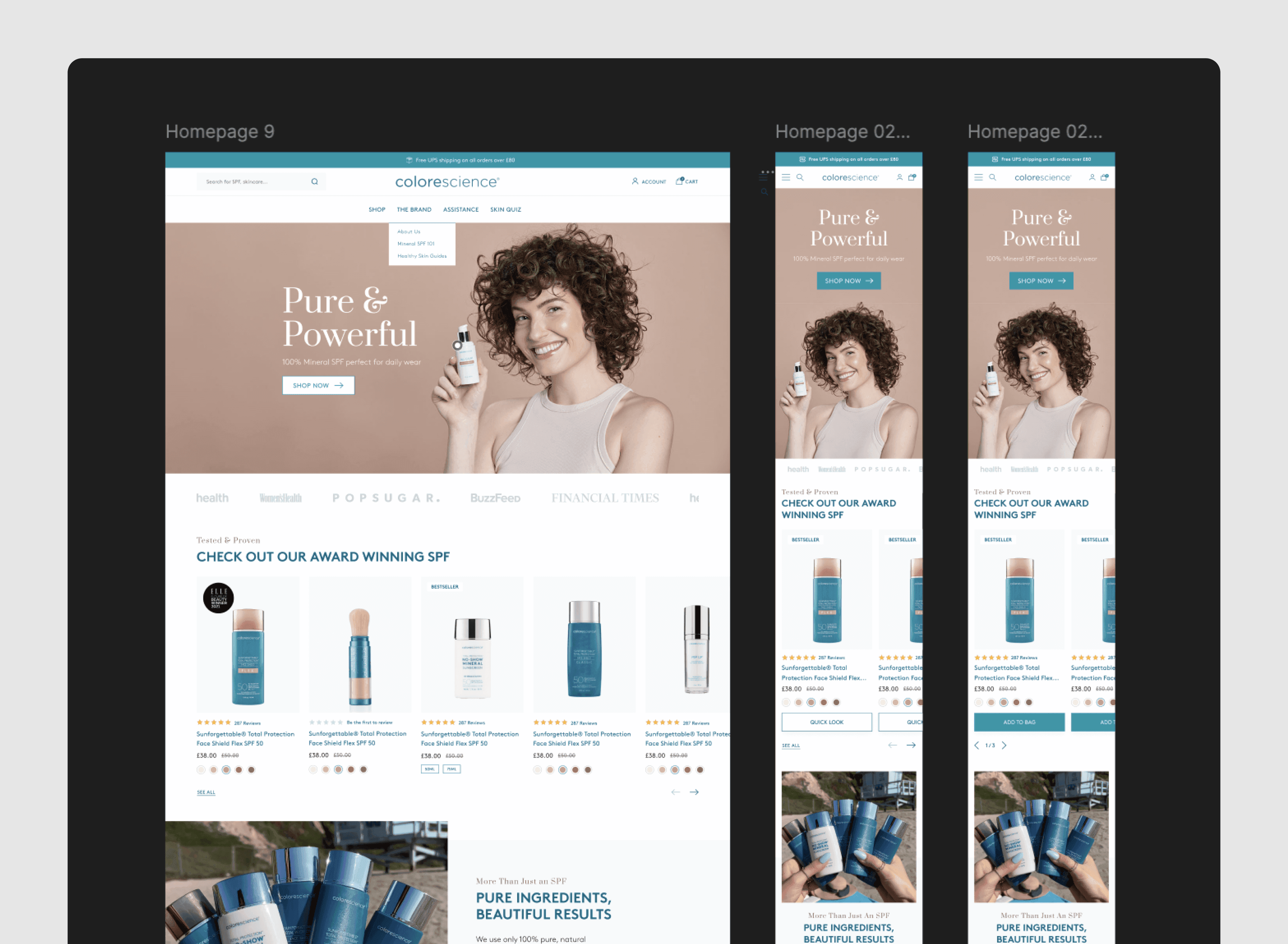
Build the new storefront 🛠️
I won’t dive too deep into the actual build process, as frankly it was a blur of Slack messages and late nights.
But I’ll talk about one specific instance:
Based on research, I knew we wanted a sliding Quick Shop drawer (something that pulls up full product details when users click on it). Shopify comes with a “quick add” component that does half the work already, but I ended up having to completely rewrite it to work as a drawer.

One of the issues with Dawn is that it’s opinionated, and making changes often means untangling a bunch of classes and data attributes.
In the end, I reworked ModalDialog into a new component QuickDrawer that meant we can “drawer-ify” anything we wanted without breaking everything. That took a lot of effort, but I think it was worth it in the end.

Structuring data with metaobjects
Metaobjects were one of the most important parts of this build, but also an early blind spots.
I underestimated just how much planning they’d require. We needed them for all kinds of things: swatch colour defaults, custom PDP content, FAQs on collection pages, and more.
This turned out to be a great way to keep content structured and reusable, but they definitely weren’t something you can bolt on later without rethinking how your data is organised.
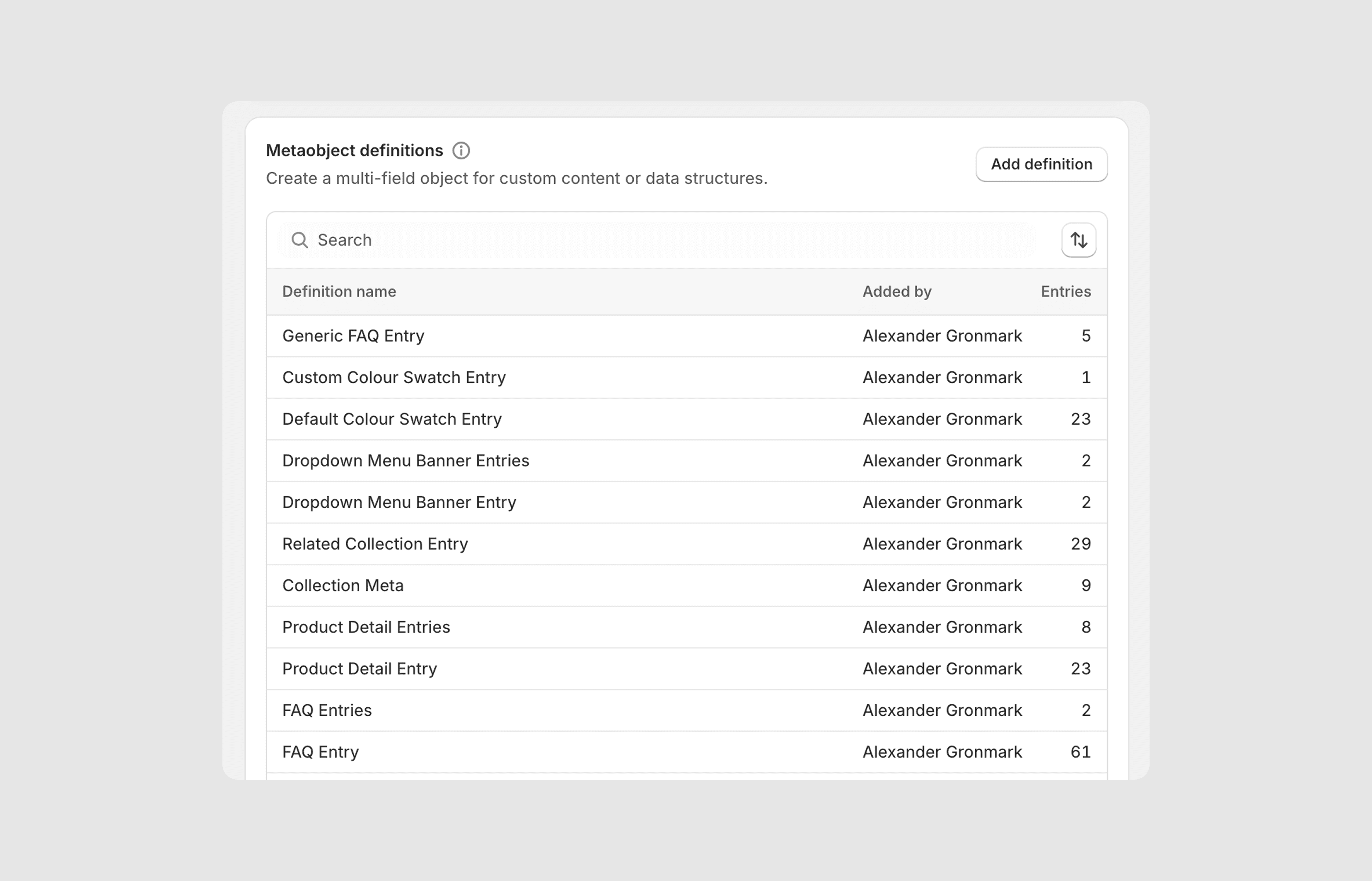
The biggest upside was safely separating content from theme code, which let marketing manage more of the site without touching anything risky.
I ended up running multiple meetings to explain how Metaobjects worked and to align on how we’d use them. It took time, but once everyone was on the same page, it became a smooth, scalable system.
Results and A/B testing 🧪
While I can’t share specific results yet – because of NDAs and active A/B tests – I can say that we saw an appreciable lift in revenue metrics.

A strong early outcome. The real goal of this project wasn’t to “get everything right” out of the gate. It was to build a solid foundation for continuous experimentation.
With the new codebase in place, it’s now much easier to test and iterate without sacrificing performance. We’ve started running smaller, targeted experiments through VWO using their visual editor (often subbing in features and ideas we didn’t include in the initial build).
Learnings 🕵️♂️
So what did I learn? A few things:
Dawn isn’t as nice to work with as people claim, too many utility classes, too much bloat, and no child themes (having to do a git merge every time you update is tedious)
You can spend a month planning and still forget critical things: it was a mistake not planning out metaobject structure early, but we got there in the end.
Having a hybrid skillset (CRO, UX and development) is super useful for moving quickly, even if it sometimes feels like you’re drowning.
After the project was finished and conversions lifted, the company wanted to move onto the next thing – but I was adamant we needed to continue optimising. This turned into me building a regular CRO strategy for the company, something I’m quite proud of.